Sunday 2 June 2013

B A T I K S the finale


B a t i k
C o l o u r 

Research & F i n a l e
(;

Wax resist dyeing technique in fabric is an ancient art form. Discoveries show it already existed in Egypt in the 4th century BC, where it was used to wrap mummies; linen was soaked in wax, and scratched using a sharp tool. In Asia, the technique was practiced in China during the T'ang dynasty (618-907 AD), and in India and Japan during the Nara period (645-794 AD). In Africa it was originally practiced by the Yoruba tribe in Nigeria, Soninke and Wolof in Senegal. Regions of Indonesia have their own unique patterns that normally take themes from everyday lives, incorporating patterns such as flowers, nature, animals, folklore or people.

Our pattern is based on mixed cultures including Indian, chinese and malay.
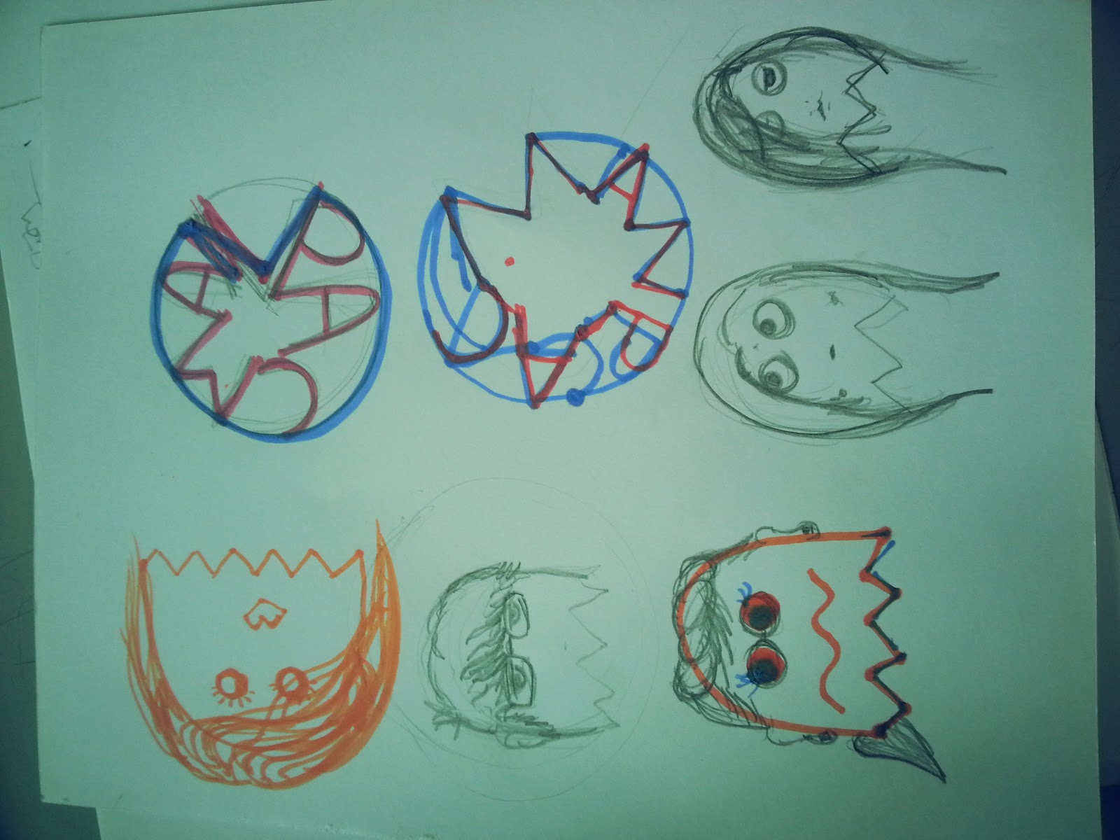
Below are some other exciting of our other peers had done


T E C H N I Q U E 

Melted wax (Javanese: malam) is applied to cloth before being dipped in dye. It is common for people to use a mixture of beeswax and paraffin wax. The beeswax will hold to the fabric and the paraffin wax will allow cracking, which is a characteristic of batik. Wherever the wax has seeped through the fabric, the dye will not penetrate. Sometimes several colours are used, with a series of dyeing, drying and waxing steps.
Thin wax lines are made with a tjanting, a wooden handled tool with a tiny metal cup with a tiny spout, out of which the wax seeps. After the last dyeing, the fabric is hung up to dry. Then it is dipped in a solvent to dissolve the wax, or ironed between paper towels or newspapers to absorb the wax and reveal the deep rich colors and the fine crinkle lines that give batik its character. This traditional method of batik making is called batik tulis.
For batik prada, gold leaf was used in the Yogjakarta and Surakarta area. The Central Javanese used gold dust to decorate their prada cloth. It was applied to the fabric using a handmade glue consisting of egg white or linseed oil and yellow earth. The gold would remain on the cloth even after it had been washed. The gold could follow the design of the cloth or could take on its own design. Older batiks could be given a new look by applying gold to them.

Now we didnt apply any gold but we did make a great first impression on each of our pieces, nothing anyone of us had expected.


My groups final layout (:

Monday 6 May 2013

EXPANDING YOUR SQUARE (The progress)

E X P A N D I N G your S Q U A R E

HAI, so recently we had done some amazing expansions with simple looking squares, here are some process photos accompanied by some others (:

D E S I G N S

When given a certain task, one must go out and find out the most suitable paths to complete it. Research, ideation, development. Trying out and testing countless methods to achieve something to figure which works best.

ideation comes from research and revision, it wont just pop in your head (;


 P R O C E S S  D E V E L O P M E N T

Here, i went with thinking of a little chessboard theme but when i was thinking of such, a chessboard didnt come to mind. Instead, a form of explosion.
An abstract form of explosion, and the best that it had come to was a chessboard. A positive outcome from this is that the little squares can be placed in so many places it inspired me even more giving me a broader view of possibilities.


Development of ideas, just to think of what you would want to do may take a few seconds but it wont be as easy to implement the ideas themselves. Focusing on just one thing and keeping a mindset for a designer can be pricey. keeping a rather open mind however, delivers a wide view to the designers and their clients and also allows them to explore new techniques for themselves.


F I N A L E


"Classic White Beauty" part II

Recently our group and i had done a 'simple' but complicated class project so here are the accompied pictures i promised. Enjoy (:


I D E A T I O N
 S E M I O T I C S 


T E A M W O R K 


D E S I G N  C O N C E P T S 


R O L E  P L A Y I N G 


Batiks part II

Back with more of our batik work and pictures of our final presentation!

The complete  layout of our work put together !

We must say we are reather proud of what we had come up with in the end being it our very first time (:


I believe this picture symbolises the fun we had throughout the procedure of this assignment mainly because we were able to express ourselves in a completely different area.


Overall, i think this assignment was a complete success.
Like a colourful dreamland coming to life.. just kidding. Lifes as legit as it could be and learning new things especially designed based is something great and to be looked forward to (:


More on taylorspod.blogspot.com

Sunday 5 May 2013

Colours of my life - Batik Painting

Olah,
Recently this week our group had gone on a small trip in town to do a painting.. but not just any painting. This special form of painting is called 'Batik Painting' A method (originally used in Java) of producing colored designs on textiles by dyeing them, having first applied wax to the parts to be... 


After waxing out the broder lines, colours are then added to the material, the wax acts as a protective border so unwanted colour doesn't pass over. Here are some beautiful examples of the final layout (:


Its fairly easy to blend colours together on the silky material and virtually any colour can be composed of.

As great as the vibrant colours look, it is just as fun to paint up. Soon i will be posting up a picture of our final design batik (:
A fellow batik professional at work


Not so Professionals at work but our work turned out better then expected (:


Saturday 4 May 2013

"Classic white beauty"

Games of every era has moved the human race forward in a way, giving designers and scientist a chance to prove something more, in this case, Videogames. For our new project we stepped it up a notch and brought out an idea of creating a vintage arcade. WHAT? thats right people, a tribute to thank those who had made mine and many people like me, lives even greater.

BUT there is a catch..   DUM DUM DUM

The whole arcade will be brought up only using paper! The main idea was to create a window decorative you see in shops' display sections but only using paper. As if that wasn't enough, everthing had to be on one colour, well technically its not a colour but everything is to be in white. WHAT?! i know, but anything is possible right? (;


Tuesday 2 April 2013

The start of the Designer in you, Monograms.

MONOGRAMS
Final on 3rd April, 2013


The first question you may ask is, what in the world are Monograms?
well.. Take the first letter of your first and surname(s) and make a design out of it representing you!
FOR EXAMPLE;

LETS just say, for the understanding of todays generation, a guy named 'Henry Shoegaurd' was to put a type of logo on his shoes to show he was the designer, he would use his first initials 'H' and 'S' in a form of a design showing people it is him who designed that very shoe.


 My Name is Kush Khandelwal so i would use my intials 'KK' giving myself a name for the world to recognise through my designs. Here is something i came up with..
I believe you got the idea now, pictures are way easier to explain instead of actually saying it out.
ANYWAYS, for my name, it wasnt easy to find something that fit both my personality and also had both 'K's in it. Designing is a time consuming thing but also something that would be worth in the end.

Now the process of me getting to this point was rather difficult and it was even inspired by a fellow designer i found online, to you my anonymous friend, i salute. 

Here are some basic ideas i put out.


As some of you know and some of you finding out, i really love wings. The anime effect, the curved structure. Just another way of sowing my personality.


Ofcourse if i had added wings in my final outcome, it would be more of a logo rather than a Monogram.
 Just to see if i could come up with a little more, i took an original Fonted 'K' as such..
Copied and reversed it on photoshop and then printed it out on a normal piece of paper to preferred size.

After doing so, i traced it out onto a transparent sheet of thin car like material so when i stencil, the paint would not go through any unwanted areas. 

Thinking it came out nice, i pressed it on one of my sketch books witch turned out like this!

Pretty cool, yes? 

The monogram will be used to identify ourselves in my final degree presentation, something like our own company where we have to present all our projects and portfolio.

Try it out for yourselves and let me check it out aswell, follow me on instagram @kushhkushh or search for Kush Khandelwal (:

Sunday 24 February 2013

Expanding your square

Hello fellow viewers, have you missed? well im back with a whole new module known as 2D design, somewhat like an advanced version of subtopics from 'principles of design'. 

On the 18th of february, we were to present on a topic called 'expanding your square' where we cut out a piece of 4x4inch square sheet of coloured paper and design it according to our  capabilities, as far as we could 'extend' (:


Firstly, i started off with cutting out a square and drew a line in the centre. now our aim was to get 2 symmetrical and 2 asymmetrical designs in total 


The first step i took was to come out with some ideas that i thought would suit and be able to complete in the given time. Note, some places it maybe easier to get inspiration then others so if you really cant think? Its not because of the time or your feelings, it could be because of where you are (: 


These were a few i had completed in class representing squares, wind and even a tribal sort of design.


 I had to try out many different ways of placing my pieces, for example, i cut out another set of the checkered board to be able to fill up my board in a way.


This was one of the moving designs, it featured a dove fliying away from my square, representing freedom (:
To be continued