Monday 19 November 2012

I 'card' resist!

Tuesday, 6th NOVEMBER
Holiday treat.

Hello there, its been awhile but im back, todays post is for this coming holidays, thinking of a simple gift for your loved one? why not a card? Its something you can keep and remember for a long time. Ofcourse it shouldnt be the only thing you get them but it sure accompanies your gift (;

Our task was to create a series containing 5 cards for any occasion, the catch is that all the cards must have some connection. Here is my series.


Hope you enjoyed (:


Wednesday 24 October 2012

GREETINGS by a card

Wednesday,  24th OCTOBER
Wishful cards

Its been awhile but im Back (: So for our most recent assignment, we were told to design greeting cards.. yes, greeting cards. Not as easy as it seems, though. The cards we are bound to design must come in a series and this series must have 5 cards of some element witch connects with one another. For example, their colour tone must be the same, such as 'black and white' or maybe all your cards have been binded, Simple. here are a few examples (:

This series has the similarity of photographs of kids

This series has a similarity of patterns, any patterns will do as long as the colour combinations and designs have a connection

The cards can be based on almost anything from weddings to birthday wishes. My ideas? my lecturer had given us a tip that we should concentrate on something we were good at and i was told im good a sketching, therefore, i continued to finalize my ideas with what i was told, here are some of my ideas. more to come (:


This is an example of a tetris like idea that i thought of as i loved the example similar to such (:

More to come, the colours and visuals.


Tuesday 2 October 2012

Whats your font? (;

Tuesday, 2nd OCTOBER
Fonts, Colours and Emotions

Hala! so today was our tutorial on FONTS and COLORS and what emotion fits in both categories. Don't understand? Let me explain. 

We were to download 'special' fonts from the internet that somehow connect with an emotion or personality aswell as a colour, for example, the word 'sophisticated' shows perfection, depth and a hint of boldness. Here's an example of my opinion on 'sophisticated'


Doesn't this font and colour, purple, show a sign of sophistication or in other words, well prepared? i had purposely spaced out the letters to give the effect an advantage and VALA, magic. amazing, no? Note, this is also my lecturers favourite and considering she is a designer herself, it boosts our confidence alot in knowing what a professional has done to succeed (:

Our little assignment was to come up with 8 different fonts and colours that include BLACK, GREY, WHITE, RED, BLUE, PURPLE, BROWN and PINK onts to connect with an emotion or some personalities and 1 that describes you, your name. Here are a few examples of what i had come up with and what i had thought, suited best for each emotion.


TADA, a new level of understanding of design for a 'designer in the making' (:

Saturday 29 September 2012

May i have this brochure?..

Tuesday, 25th SEPTEMBER
BROCHURE MAKING

To put our grid understanding to the test, we were asked to make a brochure on a specific topic :D The time constraints made the task challenging but rather fun. My partner, Ilisa Izhar ( Mona) http://taylorspodlisaizhar.blogspot.com feel free to check her blog aswell (:

As you can see, we were very focused on our work, we did not realise a camera was at large.
This picture is of my accomplice and myself ( left ) during presentation of our design


Ilisa Izhar and i worked together on this project as we were told to do so in pairs. Our theme was 'Muay Thai' and it was to promote an upcoming event. The thing is, this event is legit and was to be shown sometime in the future (: Overall went tribal as it showed tatoo designs from the Thai culture. The following pictures show us in action, building the brochure and presenting it aswell (:


THE FINAL PRODUCT


Thus our final product, it didnt come out perfect, we know we could've done better but for our theme and design, we were quite satisfied, my partner and i (: In the middle and back pages, we put the fighters and whom they are going against.


For the front page, we tilted the 'Muaythai' title slightly tilted and added yellow tribal art to match with the red title (: The title was taken from an actual Muaythai brochure.


Finally, the back pages present the 'what' and 'about' this muaythai challenge and also the home team, Taylors, pledge (: 


Good Luck, Taylorians (:
taylorspod.blogspot.com

Sunday 23 September 2012

Paper Art level, over 1000.

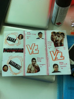
Hello fellow readers (: for our most recent assingment, we were assigned to do paper cutouts based on 2 layouts, BALANCE and SYMETRICAL (: Our assignments seem simple but not really, though they are fun. it makes you feel like you're in kindergarten again :D anyways, here is an example of what were supposed to do, but our original creation.

SYMMETRICAL


So here are a few examples of the symmetrical form
as you can see, the one in the centre is different from the

other examples because it has many different layers of cutouts,thus making it colourful. the one on the top was done using white paper, it was folded so both sides would have an equal cutting.


This is  another example of symmetry use where 
ducks were used as the subject . Here, a brown and 
crumpled paper was used to give an effect. 
A hole puncher was used aswell for the eyes.


DOMINANCE

As you can see, there is no symmetrical proportions in this 
example but there is Dominance from the bird house to the trees the kids playing.
therefore a balnced cutout. the balance is also produced from the non-cutout areas of the piece.


MY WORK in progress form

For this assignment, i have chosen to do wings. more specifically, angel wings for the balance and an angel for the the dominance. i was not satisfied with my over work so far so i decide to throw in a female face with flying hair as the balanced. here is my work so far (:


Here is one side of my angel wing for symmetry. this is after cutout and stenciling (: my next   phase would be to fold the paper in half and to outline the cutout to give the almost perfect  mirror image. After cutout, it would be an angel without a body. TADA (:

Below is what the final piece looks like without mounting. Both cutout and simple looking thougt it took roughly an hour.


For my balance piece, i decide to do an actual god like angel. t would be slightly difficult as this figure has muscle and curved body. Even to give the wings shape would mean to cutout a lot. challenging but the turnout would be great (:

As you can see, my design are sketched before i etched them. For this piece, i was sketching wings t and the body and ACCIDENTLY ended up with an idea to use this as one of my pieces (:


For my new piece on balance, i decide to do a cutout on a girl with hair flying around, reason being it would take up the page giving more detail and when cutout, the image would be understandable (: This is another difficult piece to cutout because of the hair, to get the form would  mean to cut a lot, i repeat, alot. But i believe i can make it look easy, 'even simple lines lead to great designs' as i have mentioned in my previous posts (:


Here is a rough idea of what the final designs look like.the lady on the top and the God, below. as you can see, the wings of the god were made by cuting out random shapes to give that final figure of a wing. Same goes for the hair for the woman (:


Friday 21 September 2012

So i heard you love compositions

27TH AUGUST
COMPOSITION DESIGN Lecture 3 and 4

HI :D for our lecture 3, we were thought about different compositions to making a good or great design. GRIDS, they make a good design great. grids help designers to perfect their creations. a simple explanation would be on newspapers. The many types of grids used on newspapers would be BASELINE, COLUMNS, GOLDEN RATIO and RULE OF THIRDS. Here are some pictorial explanations.


TADA, grid variations (: who knew simple random like lines would make your work look mastered and beautiful?

The first, RULE OF THIRDS would be used for most desgnis for example images.

The second, GOLDEN RATIO, splits you design into an uneven quantity allowing focus on a specific subject.

and finally.. The third, COLUMNS and fourth, BASELINE are used mainly in magazines and newspapers to align paragraphs or the body.

next - Our own work for Grid Variations. (:
http://taylorspod.blogspot.com

assignment 2 - composition update


http://taylorspod.blogspot.com2ND SEPTEMBER
So i have been having trouble updating my blog lately due to some technical difficulties but its better now,  here is a catchup on our work so far (:

COMPOSITIONS - GRIDS, RULE OF THIRDS

So we learnt about the rule of thirds, basically it is a subject matter put to a side giving empty space on the opposite or another section of the whole page, this gives balance in the image and also interest. here is an example of what i mean..


This image shows how we would divide our total layout to obtain the proper 'rule of thirds' frame :D as you can see, the left is taken up by a blank space or absence of anything but the right has a subject composition providing a balance. TADA easy, right? not to mention how interesting.


Here is one of the works i have done for my seeing of rule of thirds (: we were required to use frames to help us in direction. As you can see, the bag was postioned slightly to the left and the empty space is composed towards the right. (:  simple yet interesting.

Sunday 16 September 2012

Furniture of 'Life'


EcoFurniture

http://taylorspod.blogspot.com

Week3 Furniture design

           For our first project we are to design any eco-friendly furniture. Our group of 6 started of with a a small coffee table but eventually ended up designing for an egg chair. the most difficult part so far would be bilding the final product as the time limits constrain us slighty.


This was our initial design ideas for the coffee table. The main problem was that we kept on adding small details to the table which, eventually, made it imppossible for us to complete it on time, time flies when you're having fun, you even get carried away..


..in the end, we decided on a simple egg shaped chair like so, on top we show our design ideas, what we could include. below shows an example of our product taken from a magazine.


Trashcans for sale at a hardware store
 Our main structure will be built on 
trash cans, shaped and cut into a chair format. 


Here is an idea of what our final chair is supposed to look like. it has an egged shaped back with a wheeled base. If looked at from the top view, it would have an egg shaped feature aswell, like an oval. Sofas or cushions inside the chair would be made by clothes and tshirts which would be stuffed inside sewed shirts to give a soft feeling and pillow-like comfort.


The colour is yet to be decided but most probably, it would be a complete black or complete whit for the exterior and a bright neon colour for the interior.


Example of the texture of a chair that 
could be used in our final piece

Here is a link to our overall work and ofcourse the main page of our group, urbaneyes :D 

Furniture of 'Life' part 2 'The process'

Eco furniture part 2! 

'The process :D'

It was tough since we kept changing our ideas on what to do but in the end.. we succeeded.
althought it was not all beauty, we tried our hardest and ofcourse, we'll learn from our mistakes (: so the following will be the process of our paint job. one of the most important parts in design, the art.


here are some pictures of the stop motion work for spray paint;


TADA :D

..and this concludes the paint job for one side of one of the crates.
What did we learn from this project? it takes teamwork and alot of effort to commit in order to get a high grade. word of the day, sportsmanship.
http://taylorspod.blogspot.com